Logo for Streetwork
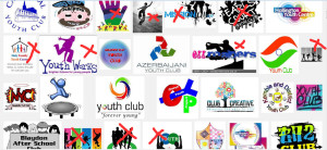
I’m designing a logo for a streetwork project for young people in Govan. Looking for some inspiration, I naturally do a Google search of other youth project logos.
I’m just going to say it. If I see another logo with a bunch of silhouettes of young people jumping in the air, I think I’ll weep. Go, search. You’ll see what I mean.
 Please don’t think I’m running down anyone else’s hard work. I’m really not. Charities don’t normally have the funds to pay a professional graphic designer. It is tricky to find an image that appeals to people and I think some of the logos I saw were excellent. It just seems that it is so difficult to find something that is inclusive of such a mixed group (I mean, in general they are just being categorised by their age) so a very generic idea is normally what is picked. What is more generic than a person? I mean, all young people are people, right? At least they have that in common.
Thankfully, the person who has asked me to design the logo is pretty clued up and already has a very clear idea about what she wants. And there’s not a silhouette in sight!
See also: grafitti fonts.

Leave a Reply